The Kardashev Scale: A Civilization Progress Tracker
An interactive explorer for the Kardashev Scale — from our current 0.73 up through planetary, stellar, and galactic civilizations. Built in a day because the tools exist now.
People keep asking where AI is taking us. The Kardashev Scale is one way to think about it — not where AI is going, but where civilization is going, and what role energy control plays in that trajectory.
The scale was proposed by Soviet astronomer Nikolai Kardashev in 1964. The idea is simple: classify civilizations by how much energy they can harness. Type I controls all the energy reaching their planet. Type II, their entire star. Type III, their galaxy.
We're at about 0.73 on this scale. Not even Type I yet. We have fusion physics but not fusion plants. We have solar panels but not a planetary grid. The pattern should be familiar if you've been reading this site: the gap isn't knowledge, it's deployment. It's overhang all the way up.
I wanted to build something that made this tangible — not a static infographic, but something you could climb through. A vertical progress tracker, ascending from where we are now toward civilizational scales that are genuinely hard to comprehend.
The Explorer
Kardashev Scale
How much energy can a civilisation control?
Click any level to expand. Ascending from where we are now.

A hypothetical civilisation operating across cosmological scales. Mostly thought experiment territory, but useful for stretching perspective.
Timeline: Beyond current models

Energy extraction and computation across a galaxy, with infrastructure spanning star systems and deep time horizons.
Timeline: 100,000+ years
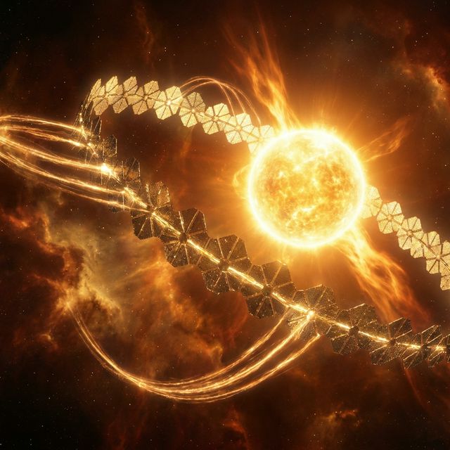
Capture a meaningful fraction of an entire star's output using megastructures, distributed collectors, and stellar engineering.
Timeline: 1,000–10,000 years
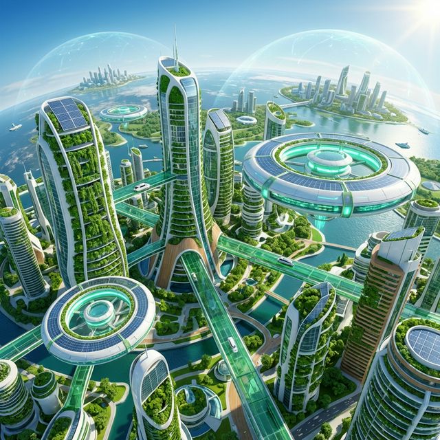
Harness and manage nearly all energy available on the home planet — sunlight, geothermal, controlled fusion.
Timeline: 100–300 years
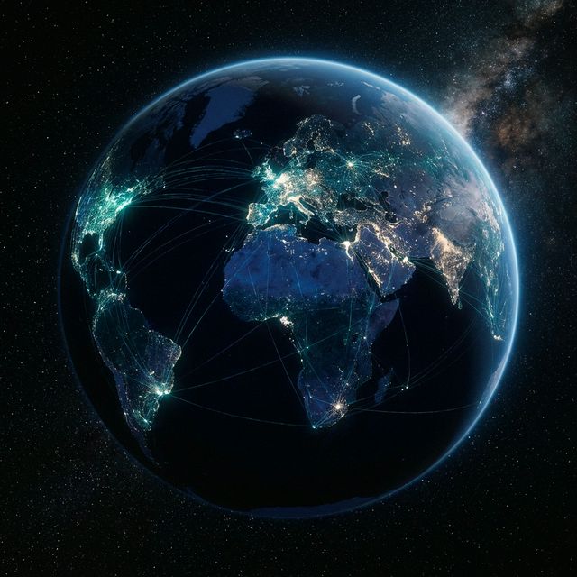
Humanity today. We rely on fossil fuels and fragmented grids while climbing toward planetary-scale coordination.
Timeline: Now (we are here)
What This Actually Demonstrates
This is the same point I made with the Hohmann transfer visualization: the cost of building custom explanatory tools has collapsed.
This component — a reactive, scroll-driven, interactive visualisation with expanding panels, milestone bubbles, and a glowing progress bar — was spec'd and built in under an hour. Not by a frontend team. By an AI agent given a reference pattern and a clear brief.
A year ago, this would have been a week-long project involving a designer, a frontend developer, and several rounds of review. Now it's a single prompt with good context.
That's the overhang in miniature. The capability exists. The question is whether you notice, and what you point it at.
On the Numbers
The timelines shown are speculative — deliberately so. Nobody knows when or if we'll reach Type I. The milestones are rough markers, not predictions. The point isn't forecasting; it's framing.
What strikes me about the Kardashev Scale is how it reframes current debates. The arguments about energy policy, grid infrastructure, fusion investment, space industrialisation — they're all arguments about how fast we climb this ladder. The scale doesn't tell you what to do. It tells you what the stakes are.
Humanity at 0.73 means we're not even controlling the energy hitting our own planet yet. Everything else — the AI debates, the climate negotiations, the space race — sits inside that context.
Go Deeper: The Tech Tree
The explorer above shows where we are on the scale. But what would it actually take to climb it? The Kardashev Tech Tree maps the technology dependencies — what needs to exist before what, which breakthroughs unlock which capabilities, and where the critical paths run from here to planetary-scale energy control and beyond.